


Mimi’s Sweeties
Logo Design, UI/UX Design
JULY, 2012
About the Company
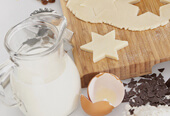
Mimi’s Sweeties is an emerging bakery in Santa Ynez, CA. As a family owned company, they are proud of their small batches, handmade baked goods, and use simple but natural ingredients in all their products.
Mimi’s Sweeties came to me with a strong sense of indentity but without a formal logo and online presence.
Goals
- To achieve a warm, friendly and fun look to highlight the family-owned company style;
- To create branding that is versatile enough to work on a wide array of collateral;
- To emphasize the family history of primarily producing handmade baked goods;
- To design a website that will reflect branding through every page.
Process
Phase 1–Logo Concepts
I worked with the client to defined the positioning of their brand and created a logo that would speak to their audience: urban families with kids, who care about the quality of their food and love homemade style.


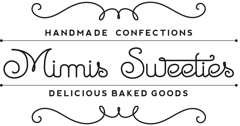
Emily Regular font had that handmade feeling I was looking for, but it wasn’t quite right. Some of the letters looked segmented and/or rough. So I handrew (and later vectorized it) my own font inspired by Emily Regular.
Final logo


Phase 2–Style Concepts
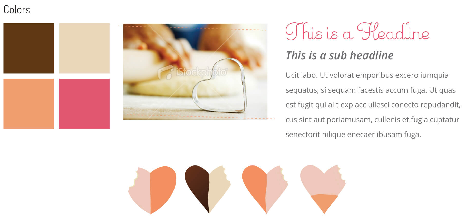
With a hand-drawn logo in place, I picked a warm color scheme to complement the brand message. I sketched icons based on Mimi’s Sweeties best seller cookie, and used teaser pictures to tantalize
the viewer.
Phase 3
Bringing it all together.
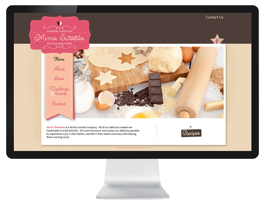

The project time-frame was tight. Mimi’s Sweeties wanted to promote their products through the new website a few months before Christmas. I had couple weeks to collect company info, research competition and come up with mockups (logo and website design).
