
Sephora Mother's Day Promo
Graphic Design/Art Direction
April, 2016
About the Company
Sephora is a French chain of cosmetics stores founded in 1969. Featuring nearly 300 brands, along with its own private label, Sephora offers beauty products including makeup, skincare, body, fragrance, nail color, and haircare.
Mother's day is one of the biggest retail "holidays". From in-store merchandise, print and digital, months in advance, Sephora's marketing efforts are focused on the mother's day campaign.
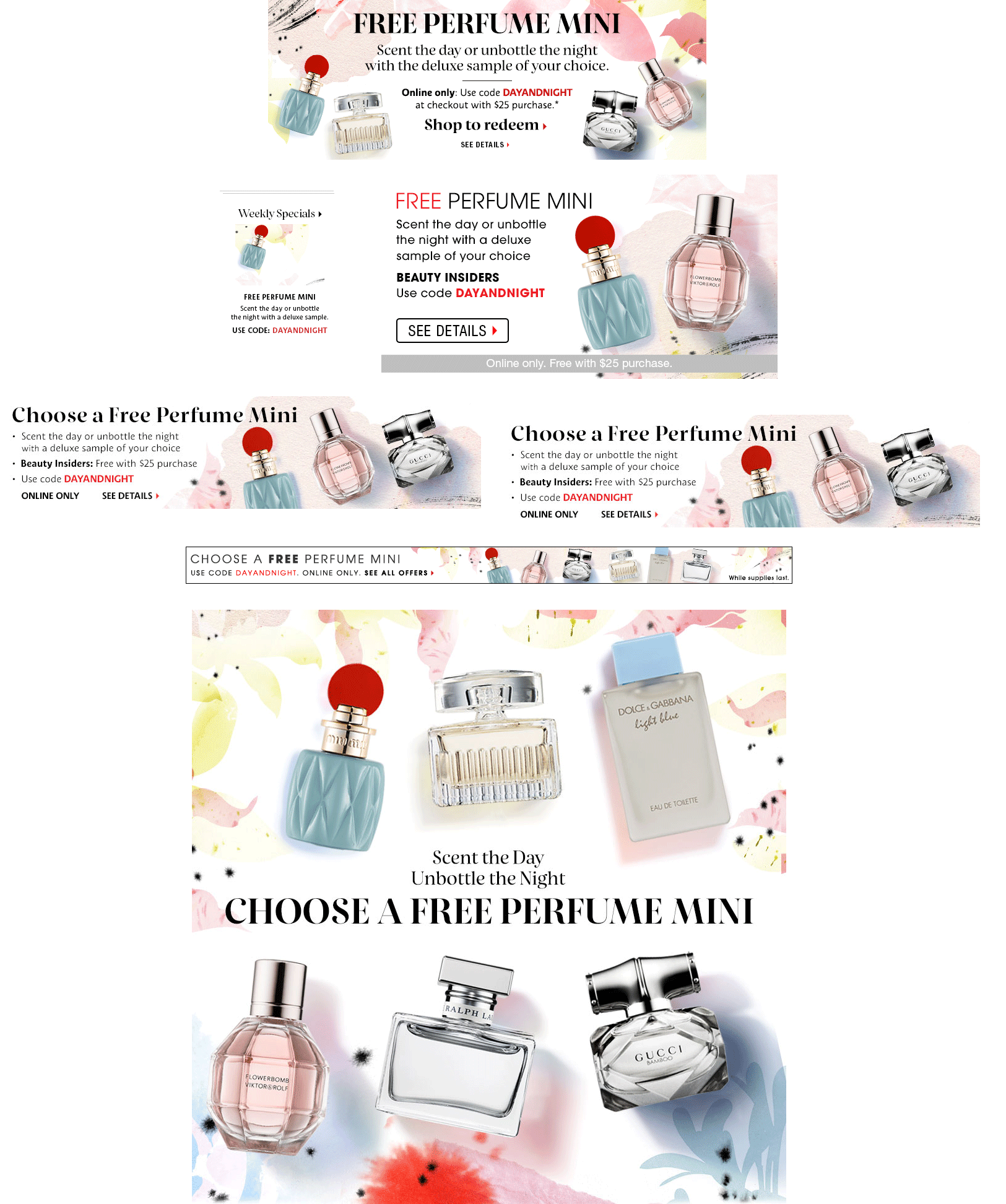
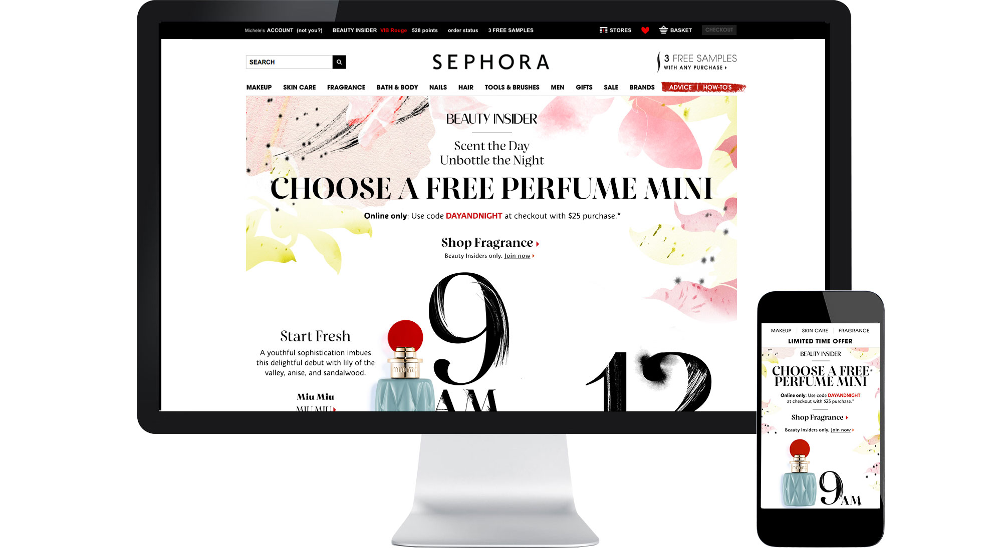
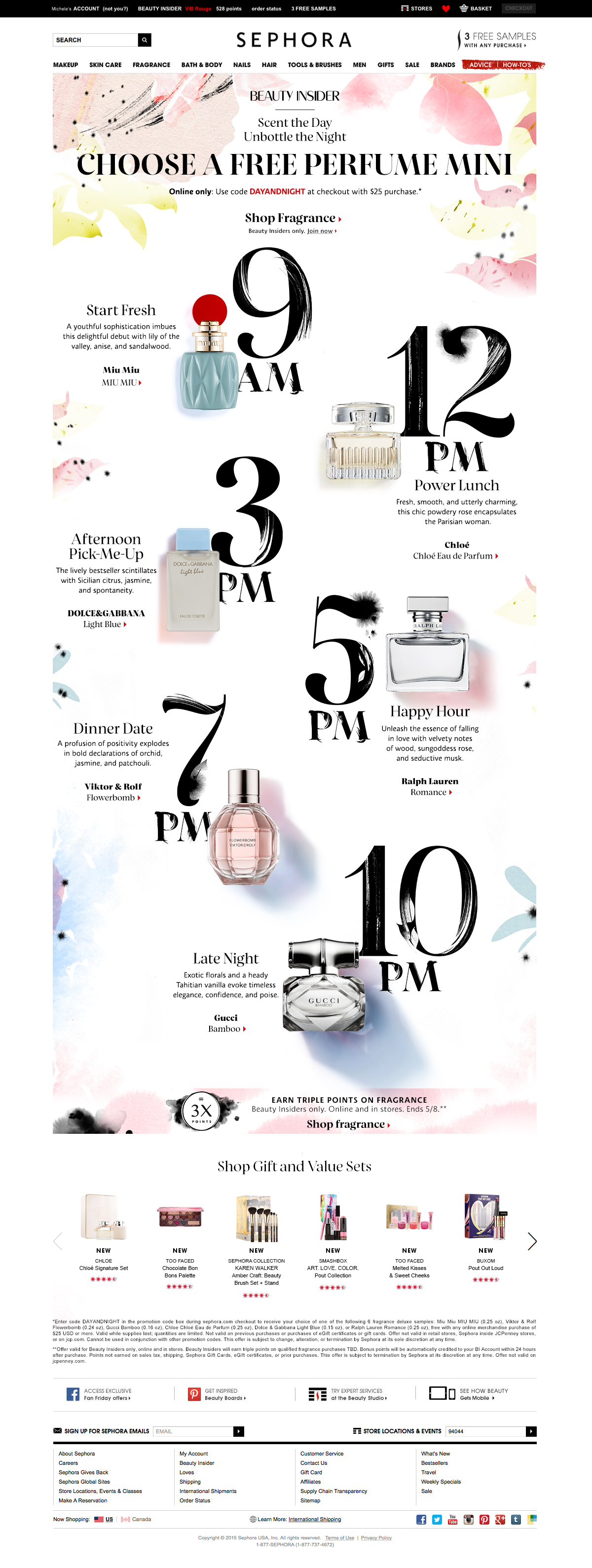
To promote more online sales, the digital team created a promo/campaign offering a pick of 1 of 6 free mini perfume bottles with a $25 dollar purchase on Sephora.com
Goals
Create a viewer enticing, cohesive digital campaign to promote more sales for one of the biggest retail holidays;
Photoshoot mini fragrances bottles;
Create a visually appealing landing page for desktop and mobile;
Design supporting marketing materials (digital advertising).
Process
Phase 1-Reference
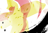
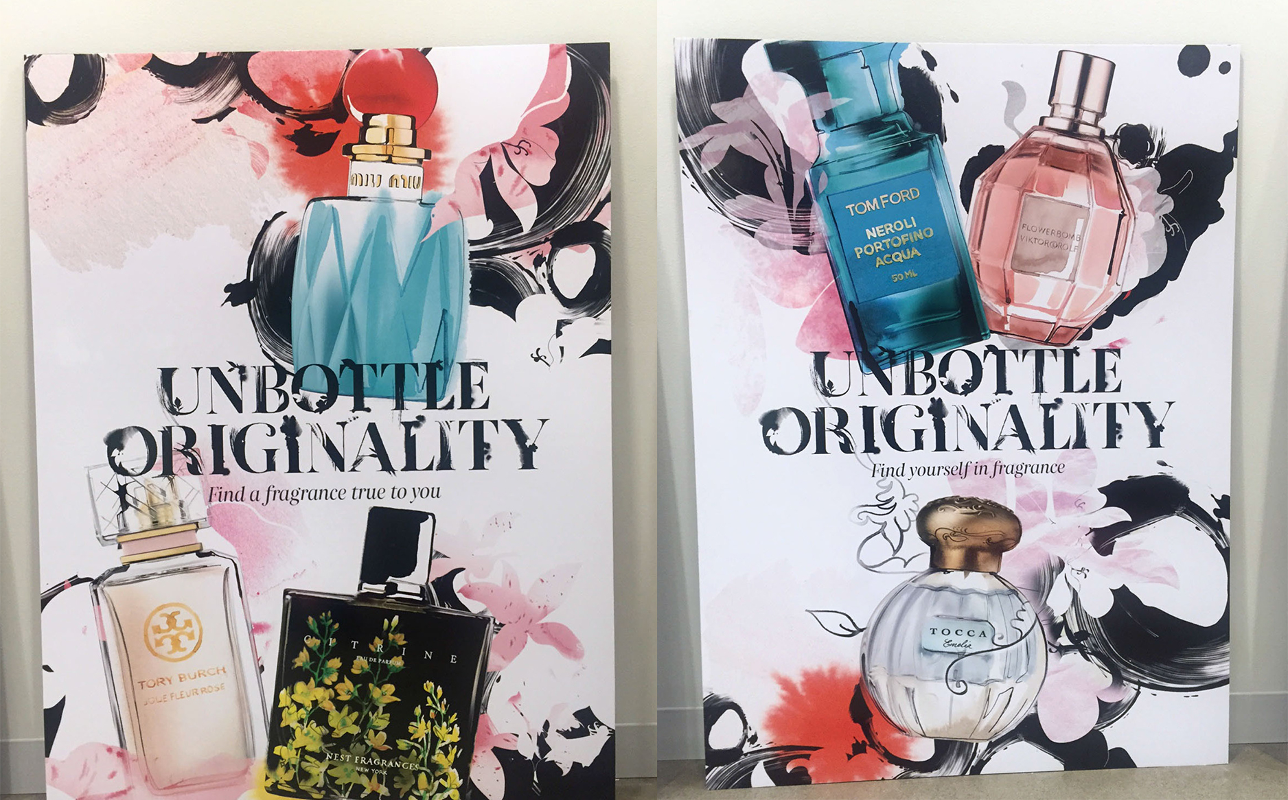
Sephora commissioned an artist to create beautiful illustrations of fragrance bottles and cohesive style font. The artist illustrations were the visual reference for the project.
Inspiration
Colorized shadows were the art direction inspiration for the photoshoot.
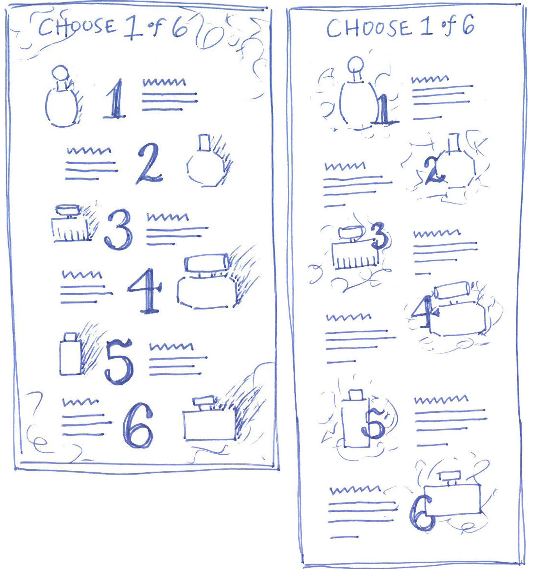
Phase 2–Sketching the Landing Page
Before starting the onscreen design process, it is always helpful to sketch out the hierarchy of content first to use as reference later.
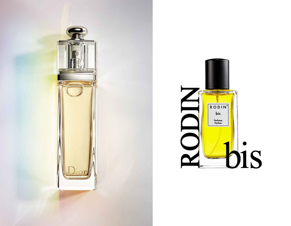
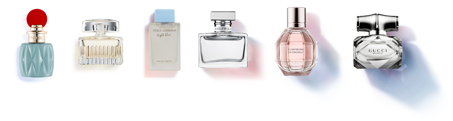
Phase 3–Photoshoot
In collaboration with an in-house photographer, we shot each individual fragrance bottle with colorized shadows. The shadows would represent the time of the day the perfumes are recommended for.
At Sephora, the photoshoots have often a few phases: inspiration, styling direction, art direction deck and retouching notes. I won't get to those details on this project, but rather, I will start a whole new separate project to talk only about the shoot phases. Coming soon!
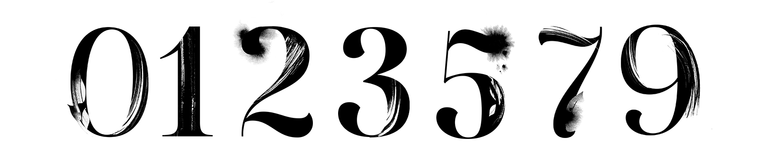
Phase 4–Design
Leveraging the artist patterns, fragrance shots and stylized numbers to create a stunning desktop and mobile landing page. In this project phase, I worked in collaboration with a writer responsible for the campaign copy.
Phase 5–Email and Digital Ads
Through a dedicated email, consumers were alerted of the mother's day promo and presented with the campaign look and feel. The email linked viewers to the landing and shopping pages.

Digital Banners
Several digital banners were created to promote the campaign. All of them consistent with the overall promo look and feel, using the brush stroke pattern, typography and fragrance shots.